


Layout Systems
FO Framework uses a 12-column responsive grid system inspired by Bootstrap. It provides flexible containers, rows, and columns to build layouts for any screen size. The system is mobile-first and scales up using responsive breakpoints.
It is a layout type used for admin pages. There are three different navigation types.
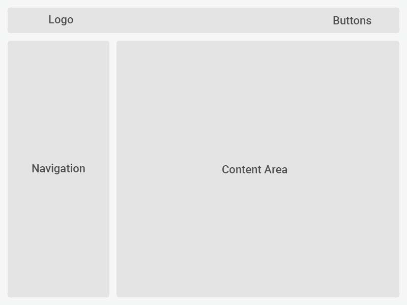
It is a layer where the routing menu is located on the left. In this layer, it is optional whether the left menu remains open or not. It becomes active when the mouse is hovered over or with the on/off button. With the sidebar-left-collapsed class that you add to the HTML tag, it can be kept closed all the time, and in the absence of this class, it can be made open all the time.
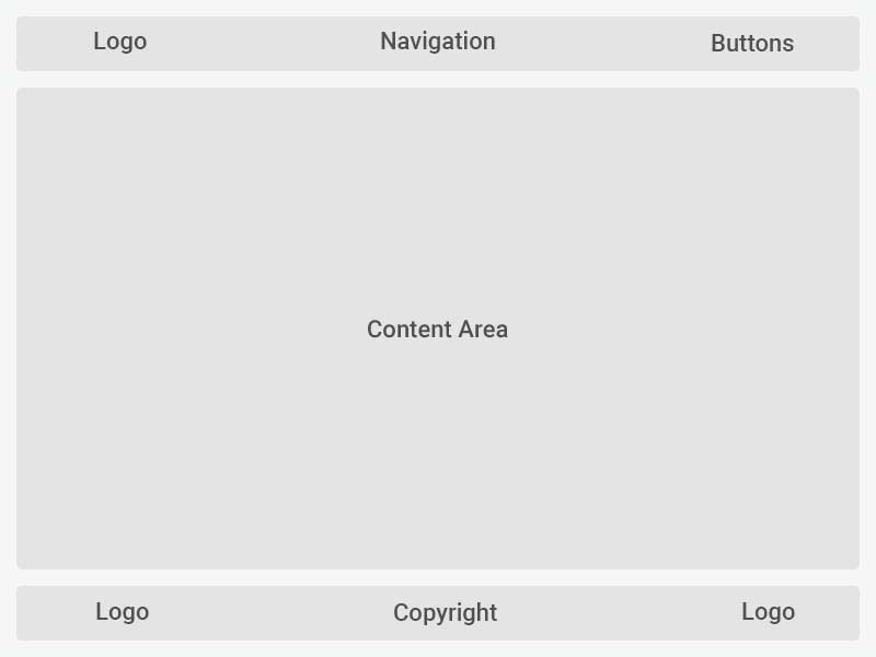
It is a layer with the navigation menu at the top. There are three types of menu links. Normal menu link, dropdown menu link and mega menu link. Above are examples of uses.

It is a layer that does not have a routing menu.
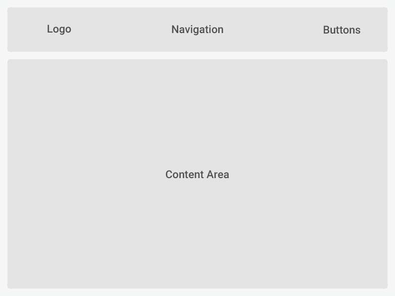
It is a layout type used for multi-purpose page designs.