


Media Optimization
This section covers techniques for improving the loading speed and performance of media content. Responsive images, lazy loading, modern formats, and CDN usage are explained below.
1. Responsive Images (Srcset & Sizes)
Use the picture element and srcset for serving different image sizes based on viewport.
2. Lazy Loading
Allows images outside the initial viewport to load later, improving initial page speed.
3. Modern Formats (WebP, AVIF)
WebP and AVIF formats offer smaller file sizes compared to JPEG/PNG. Use the picture element for browser compatibility.
4. CDN Usage Example
Ford images are served via CDN, for example: fof.ford.com.tr.
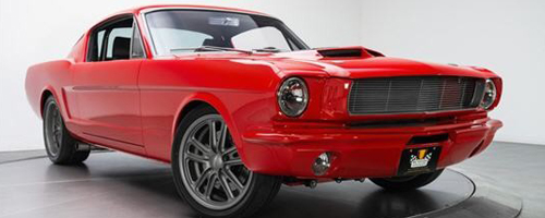
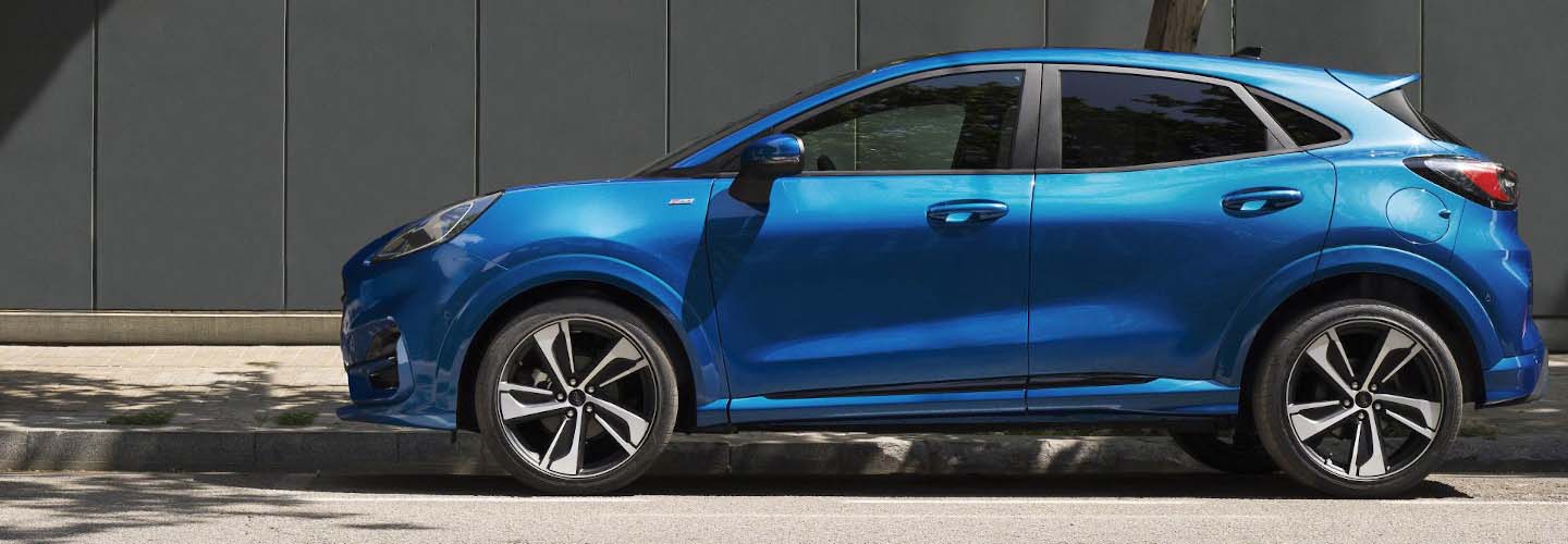
5. Image Comparison (Before vs After)
The images below compare non-optimized and optimized versions.
 PNG 882Kb
 WEBP 49,4Kb
6. Best Practices
- Always provide
widthandheightfor images. - Use a CDN to serve media faster.
- Inline SVGs for better control and scalability.
- Use
loading="lazy"for non-critical images. - Provide multiple resolutions via
srcset.